


Here Our New Forum Look - Share your Feedback
- 10519
- 54
-

- Last Comment


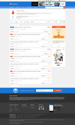
Hi All,
Soon we are going to Revamp our forum and its going to look something like this.

Or Use this url : https://cdn0.desidime.com/ddb/Forums-new-lo...ng
Your Feedback/Opinion/Suggestions are welcome.
Mobile Version


NIce
When are you guys planning to update the iOS App on AppStore?
It has never been updated EVER. iOS 11 users can’t even use the outdated one.
PS:New forum looks great!

Automatic notification count down when we saw the deal….

Hmmmmm, in line with rest of the pepper 😉
MRP and price drop percentage should also be included


Can you make a separate section for contests?
Recent Posts section gets spammed when contests are running.
It’s good UI. Designers are doing great work.

Any change in the mobile version ?
Great

The image of the product is missing. This is a very useful feature to identify the product you are looking for. The image guides you what the deal is all about.

I have a suggestion , why you dont keep listing for the hot , new and recent in th main page , I mean for all the three , and
more option at the bottom of each , So any one choose more and go the corresponding section .
This way It will be more user friendly .
Nice

I guess recent activity should be there below the Submit Deal option and above Leaderboard like it was used to be in earlier Desidime shwoing new post, likes, vote up etc.
so even on your big screen (24inch+ ?) only 8 topics visible per page? 
ssomething isn’t right
2] the store name across each deal is currently not shown in the mobile site.
Pleease can you ensure that next update of the mobile site has this?
it is irritating to have to open the deal page just to realise it is a shopclues or voonik deal
3]
present color schem edoesn’t find favor with new designers  ?
?
bluw was good, ain’t it?
http://imgur.com/a...hn
https://cdn0.desidime.com/attachments/photos/77...

There should be a log to check my gift redemption and their status , like we place orders on amazon  @bumblefoot
Also there should be a column on profile page to check each dimer’s lifetime dimes 
Please consider these suggestions for the new layout

One more history of gold dimes earned 
Simple & sober hence attractive. Great UI

Should have option 

If product image also add one side it will be good.

h1. 2) Prioritize deals. No pinned/featured thread(FAQ, contests etc) in hot deals section.

20,000 ka ceiling fan  with 2% discount became fpd wow
Ps- kidding, site looks good with all changed layout 

There must be an option to save the deals u like
You can follow that topic currently as well

Old style should be optional as well, like Classic version

+1

@ujjwalgarg those will be there.
@AtulAggarwal ping me those, will get them checked.
@skaluva its hot/new deal page. (so all forum pages will look like this)

Already tagged u many times over last 6-9 months. Will tag u again

One More Thing I Would Like To Add is that
Create a Separate Layout for Channel Section, Currently is inside Deal But Either do rename of that.

isnt it much feasible inside. As one will anyhow open and check url/offer etc and then will add it to its channel (soon it will be groups).

John Smith
Awesome👍

Gold dimes removed??

+1

looks to Be Clear & Sorted.
But The Area Of the Description Of the HotDeal I guess is Occupying Too Much Area

Wooo
Definately more colourful & Attractive, however seems more space taking hense less number of deals per page which should be looked upon.